In short
- The problem
- Plans scattered across chats, emails and spreadsheets, so nobody had the whole picture at arrivals and city changes.
- Research
- A survey of 20 group travellers with follow-up interviews.
- What I did
- A tablet system where each screen answers one question, with a colour for each city and a map of who creates, suggests or just reads. Designed around a four-city, nine-day trip.
- The trade-off
- Depth over breadth. No shared editing, messaging or bookings yet, so the coordination problem could be solved properly.
- Status
- A concept. It has not been tested with travellers.
Self-directed project. The research was a survey of 20 group travellers with follow-up interviews.
 (opens the full-size image)
Everyone had the plan somewhere, and nobody had all of it
I surveyed 20 recent group travellers aged 24 to 38 with ten questions, then followed up with informal interviews to dig into what the survey surfaced.
| What they said | Travellers |
|---|---|
| They had used three or more tools to plan their last trip | All 20 |
| They had missed a booking because of poor coordination | About 13 of 20 |
| They wanted a visual itinerary they could scroll through quickly | At least 16 of 20 |
The same three breakdowns came up again and again: uncertainty about shared decisions and timing, too many tools to keep track of and no clear picture of the trip as a whole. Each person had part of the plan in a different app, so nobody could see all of it when they needed it.
Three kinds of traveller, and the quiet one matters most
| Traveller | How they plan | What they need |
|---|---|---|
| The Initiator | Runs the whole thing and feels responsible for the trip going well | To track decisions and who has replied, without chasing |
| The Responder | Joins in bursts and loses track across scattered threads | Clear summaries and a simple way to vote |
| The Ghost | Turns up with no context and worries about missing decisions | A quick summary of what has been decided, for very little time |
The Initiator runs everything. The Responder joins in bursts. The Ghost turns up with no context and needs to catch up in seconds. Most planning tools are built for the Initiator. The hard part was one system that holds all three, without anyone feeling it was designed around someone else.
Each screen answers one question
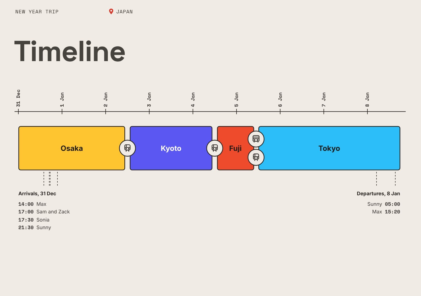
The Timeline answers where we are in the trip. The Day Cover answers what is happening today. Arrival Directions answers how to get to the accommodation right now. No screen needs context from the one before it, so each screen makes sense without having seen the one before.
| Traveller | Trip setup | Before travel | Each morning | Catching up | After each day |
|---|---|---|---|---|---|
| Initiator | Trip overview: creates | Arrival directions: creates | Not used | Timeline: creates | Timeline: edits |
| Responder | Trip overview: follows | Arrival directions: suggests | Day covers: suggests | Timeline: suggests | Not used |
| Ghost | Trip overview: reads | Not used | Day covers: reads | Not used | Not used |
A colour for each city is the thread through all of it. Osaka is yellow, Kyoto is purple, Fuji is red and Tokyo is blue, so a traveller who picks up the tablet mid-trip knows where they are before reading a word. Everything else stays neutral, so colour only ever means location.
Wireframes before colour, and mid-fidelity before photos
 (opens the full-size image)
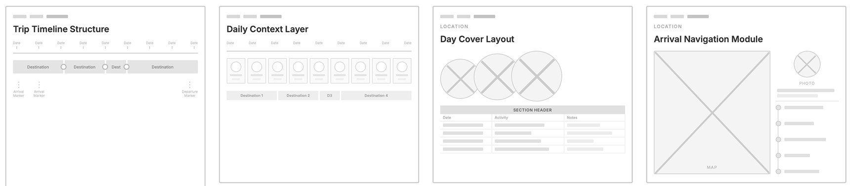
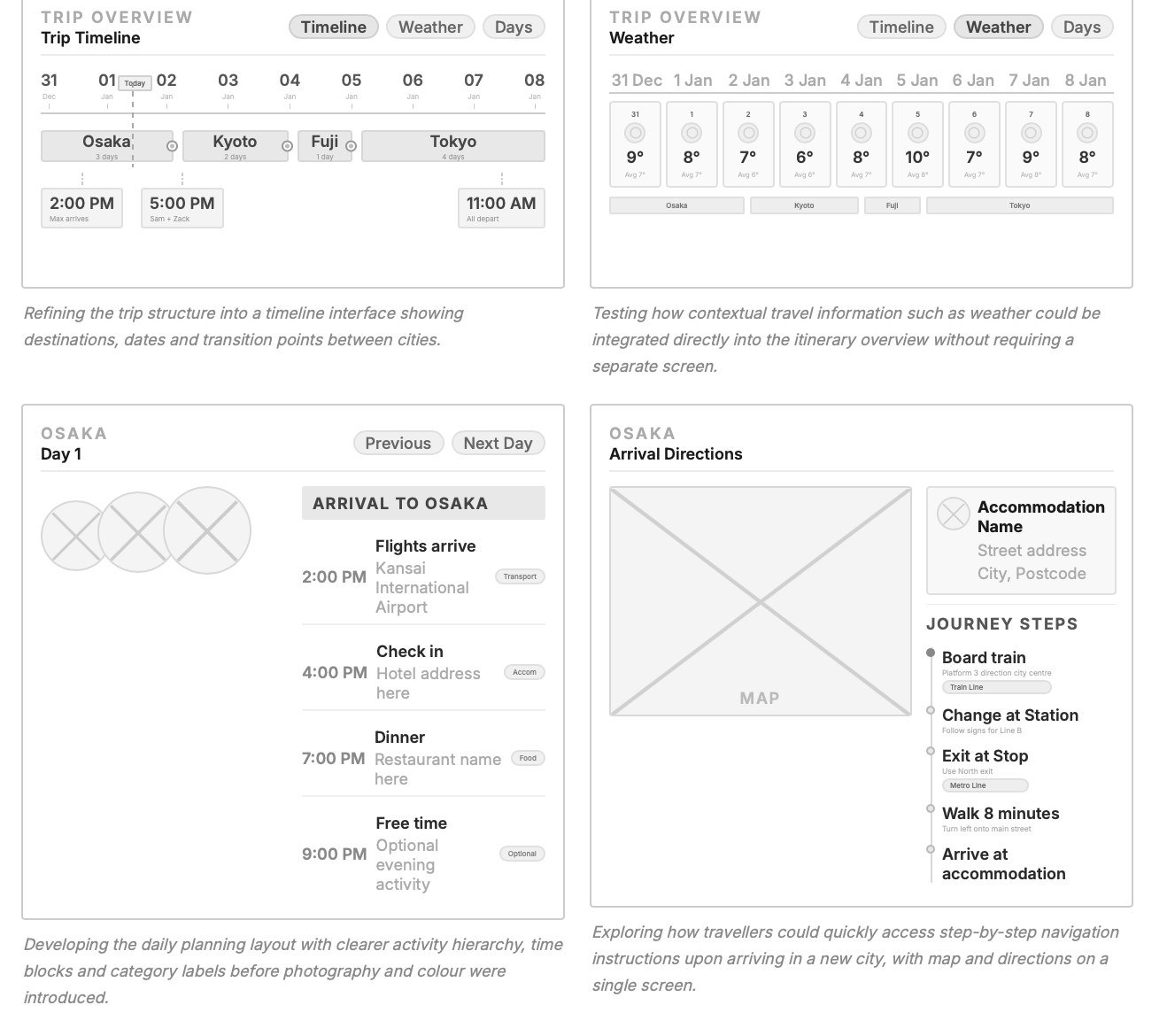
The low-fidelity pass tested whether a multi-city trip could be split into modules at all. The mid-fidelity pass added real components and spacing while staying grey, so each module could be judged as a working screen before the visual layer went on.
 (opens the full-size image)
The trip, then each day, then each arrival
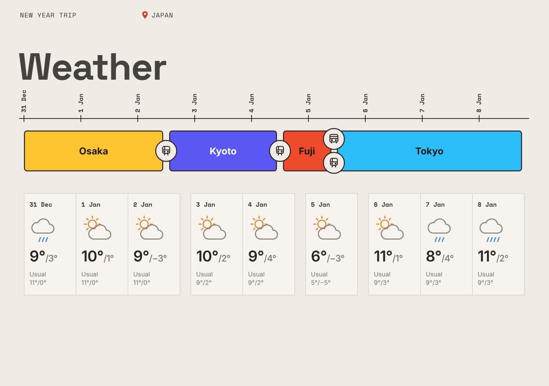 (opens the full-size image)Weather across the trip
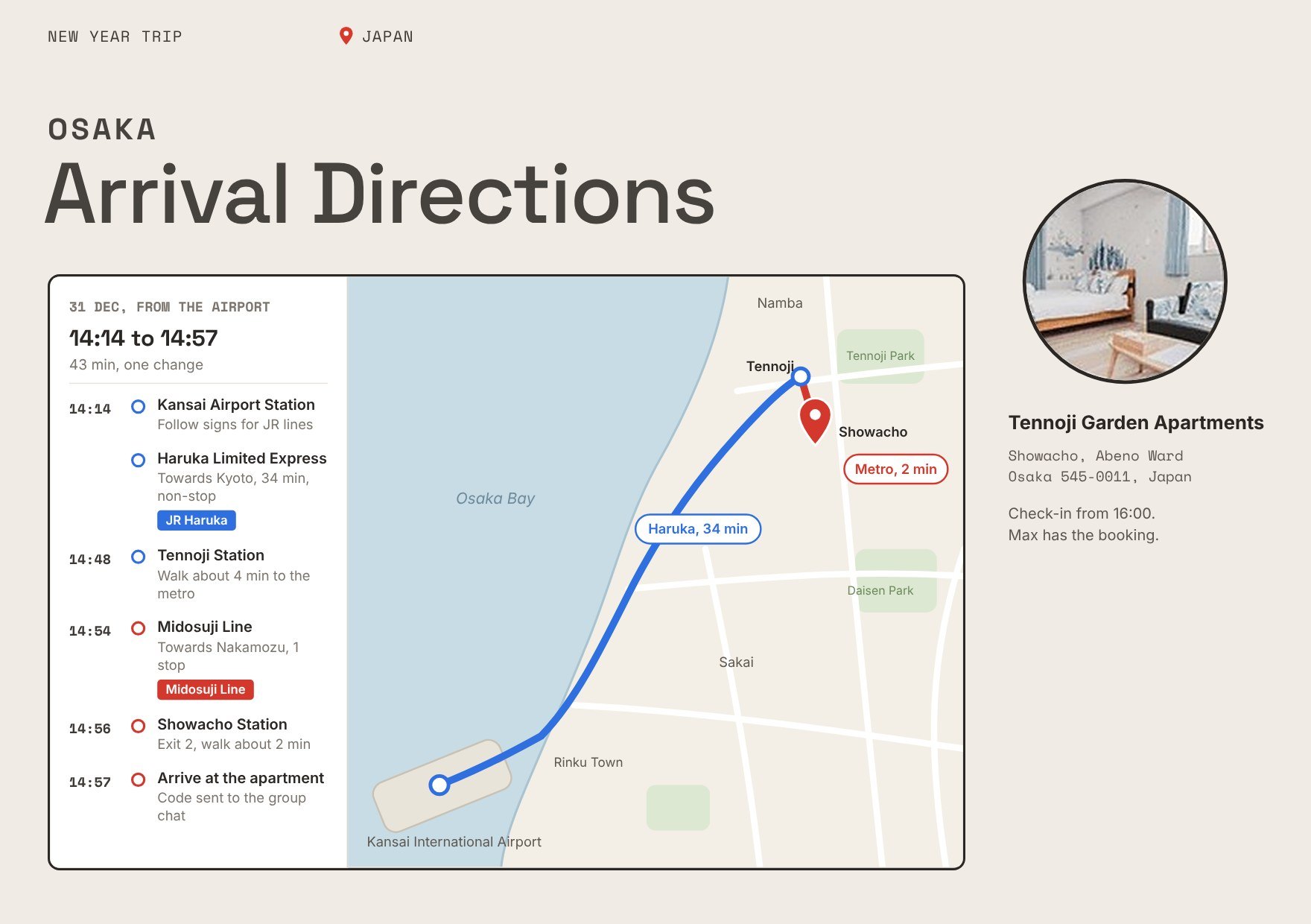 (opens the full-size image)Arrival directions, Osaka
Arrival is the most stressful moment of a group trip, so Arrival Directions gives the route and map most of the screen. In that moment, knowing where you are matters more than knowing what comes next.
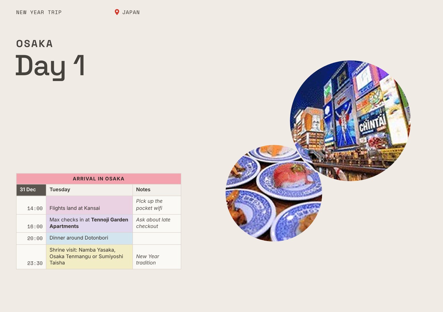 (opens the full-size image)Osaka, day 1
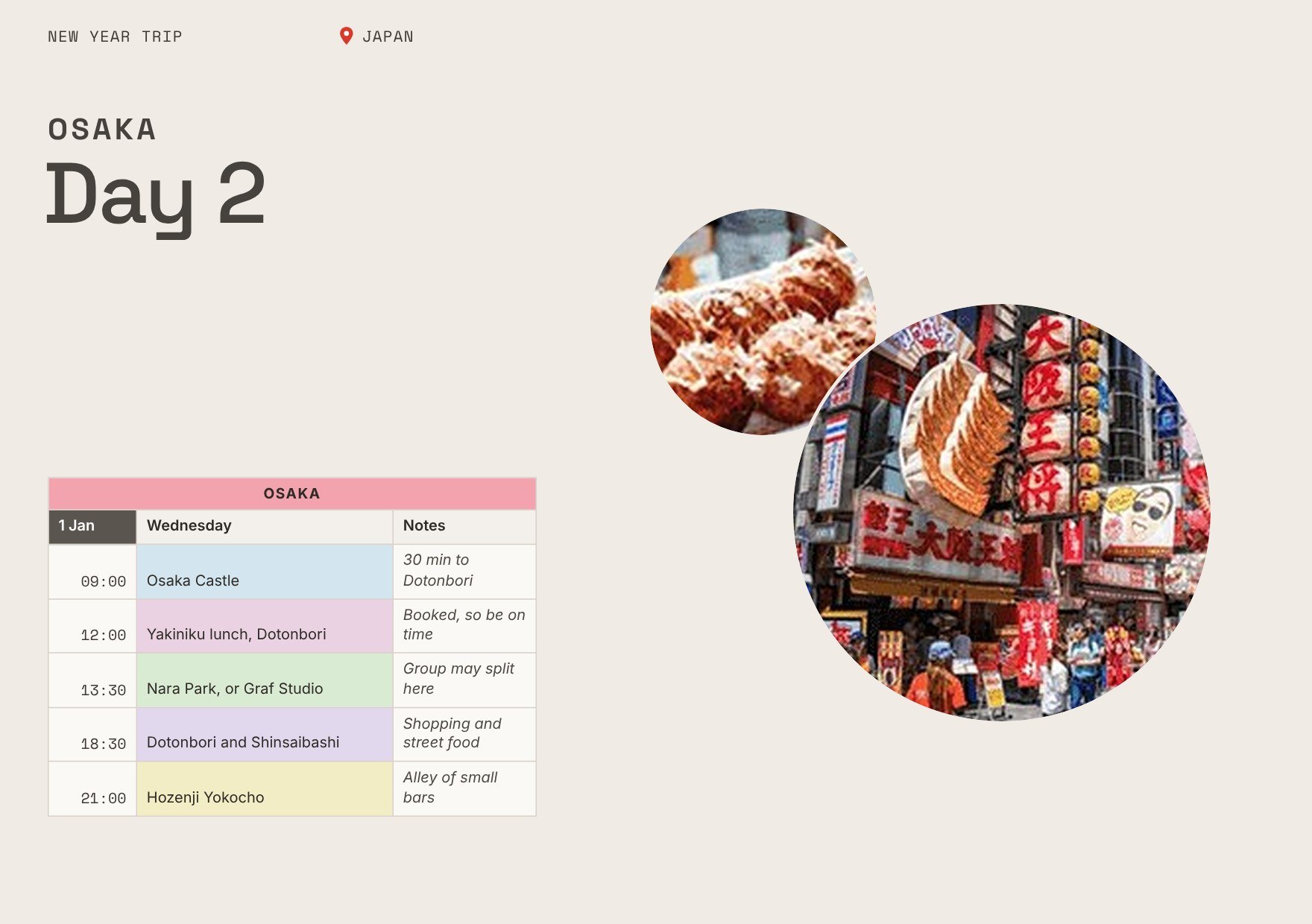 (opens the full-size image)Osaka, day 2
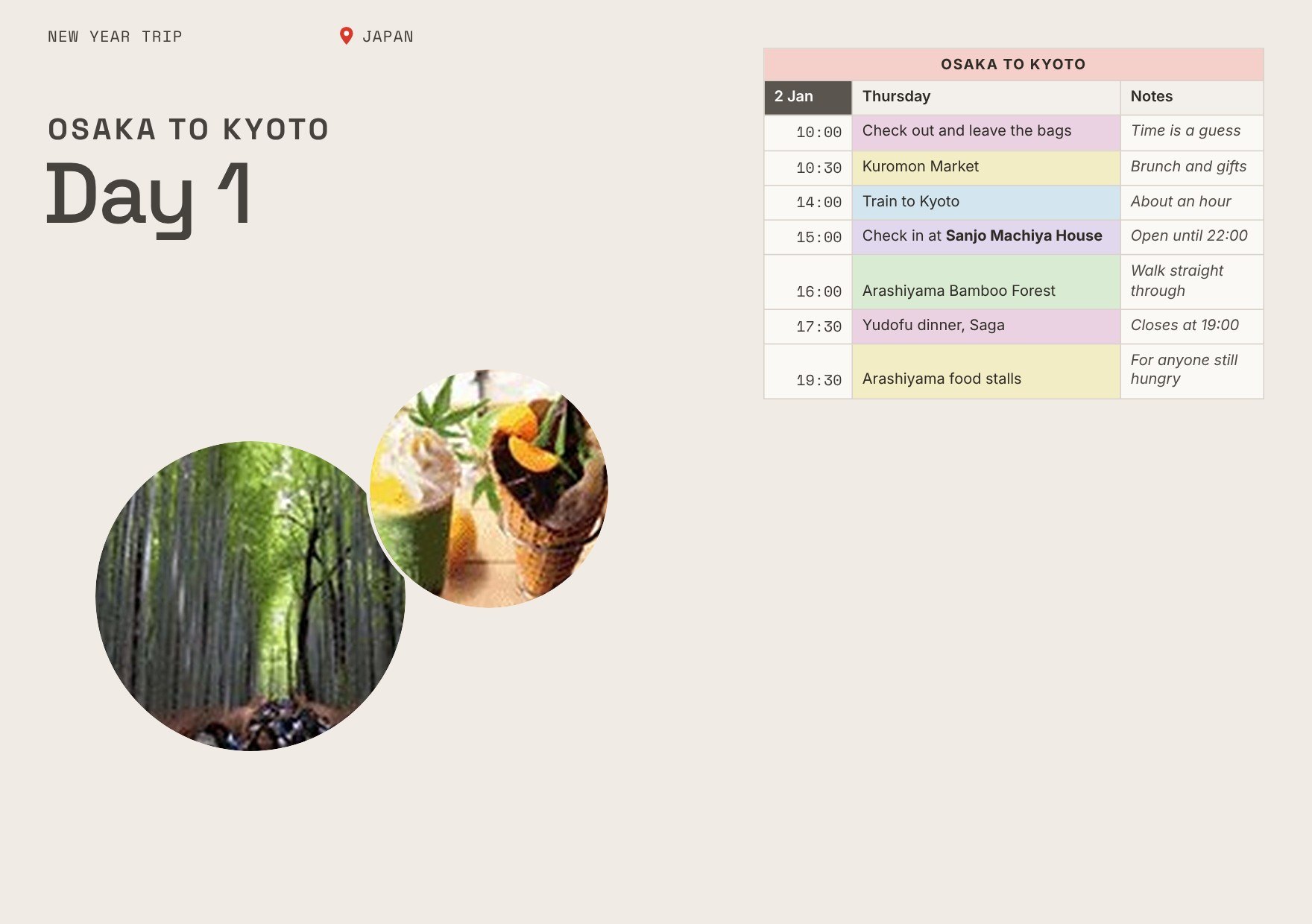 (opens the full-size image)Osaka to Kyoto
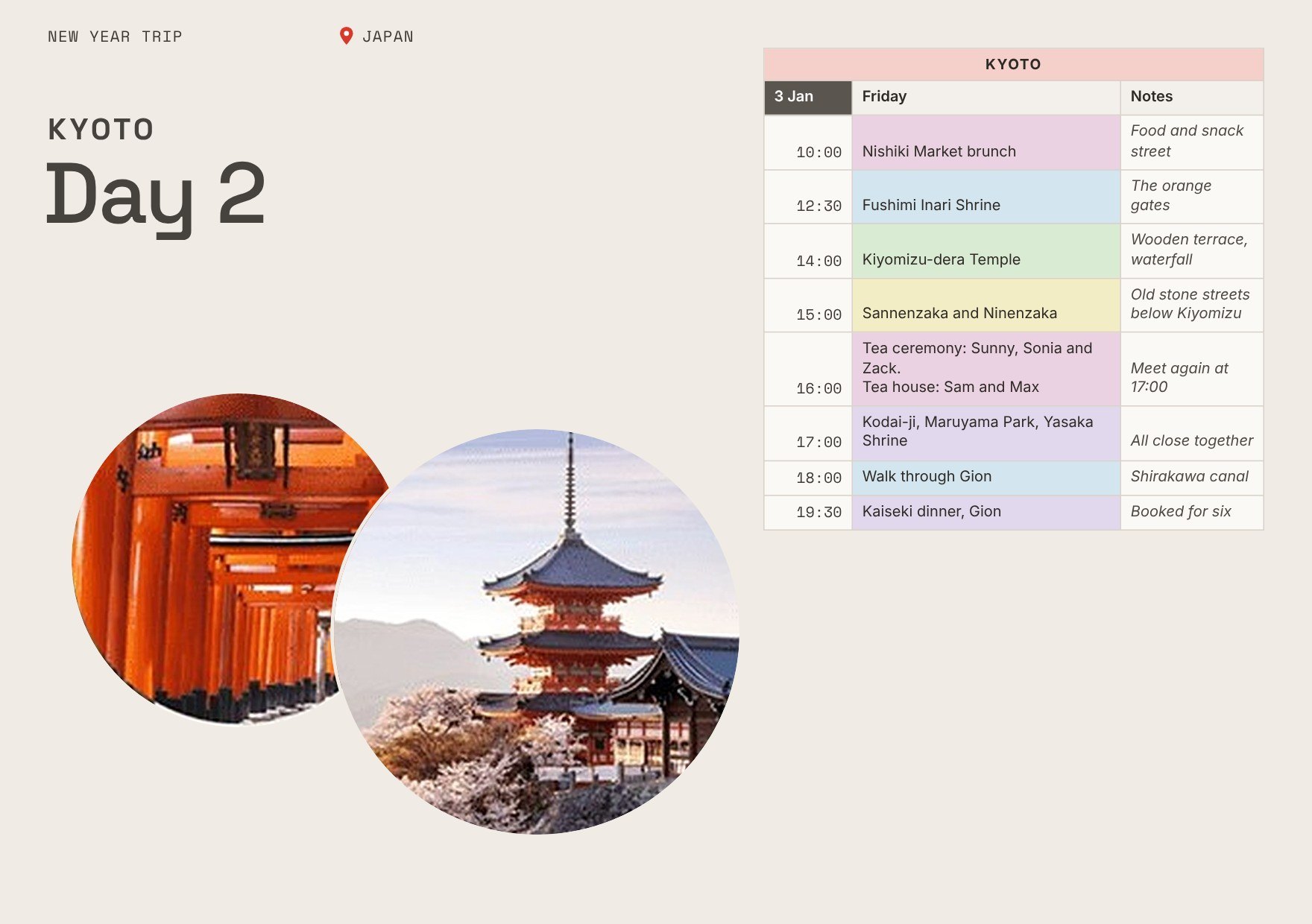 (opens the full-size image)Kyoto, day 2
The first Day Cover had six columns of information. It looked thorough on a desk and would have failed on a platform, with luggage and a group waiting for someone to say which way. I cut it to three, which can be read at a glance, and I resisted that cut for longer than I should have.
I designed for the Ghost without asking one
No Ghost-type traveller took part in the research, so I argued for them second-hand. One of them would have challenged the information hierarchy earlier, and with more authority than I had on their behalf.
The scope was a deliberate trade. A real product would need shared editing, messaging, expense splitting and booking integrations. I went deep on the coordination problem instead of wide on features. Next I would build a mobile companion for the moments that happen on the move, and a light way for anyone to flag a question without restructuring the plan.
If this is relevant to a role you are hiring for, I am glad to walk through the screens and the decisions behind them.